This section brings together a range of long-form and structured communication design, including white papers, case studies, presentations and branded reports. The work focuses on translating complex information into clear, accessible and well-structured layouts, with a strong emphasis on typography, hierarchy and consistency. These projects were developed for clients across the fintech and education sectors, often working within strict brand guidelines and in collaboration with marketing, legal and commercial teams.
Liberis needed dense, sometimes technical business information turned into materials that clients would actually want to read and use, all while staying firmly within brand guidelines and getting sign-off from legal and commercial teams. This covered several different needs: preparing clients for a specific high-pressure trading period, sharing proof that the product works through real client stories, and pitching a joint funding offer with a partner brand in a way that felt credible rather than overly sales-led.
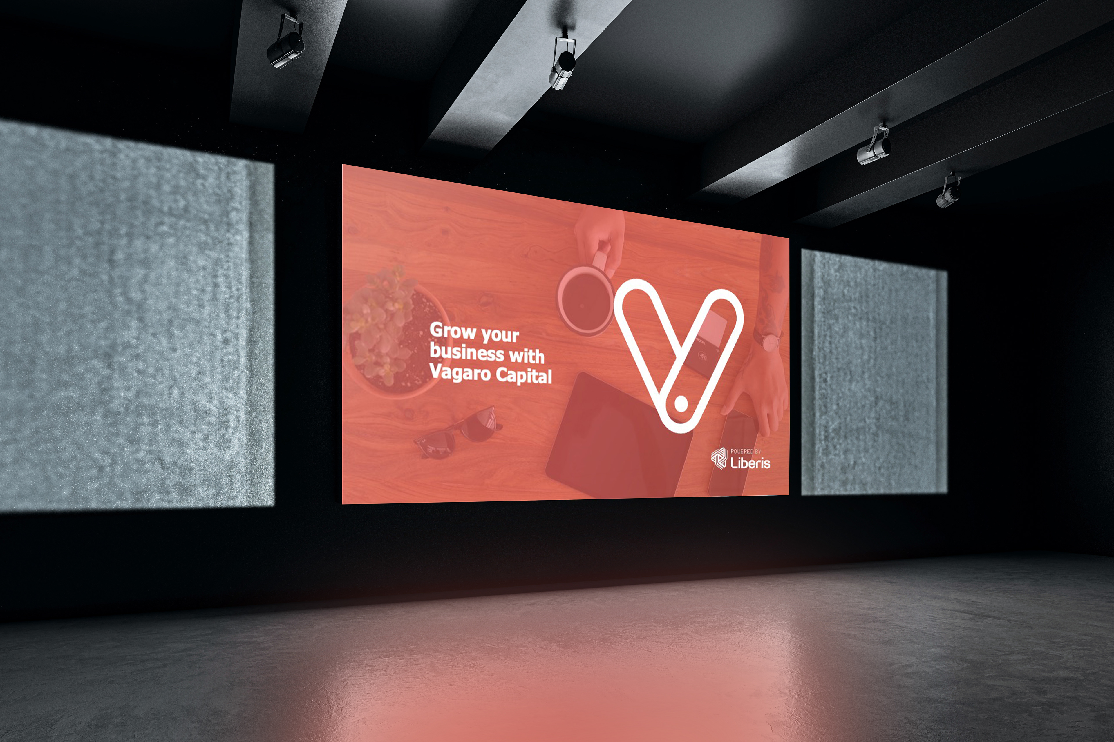
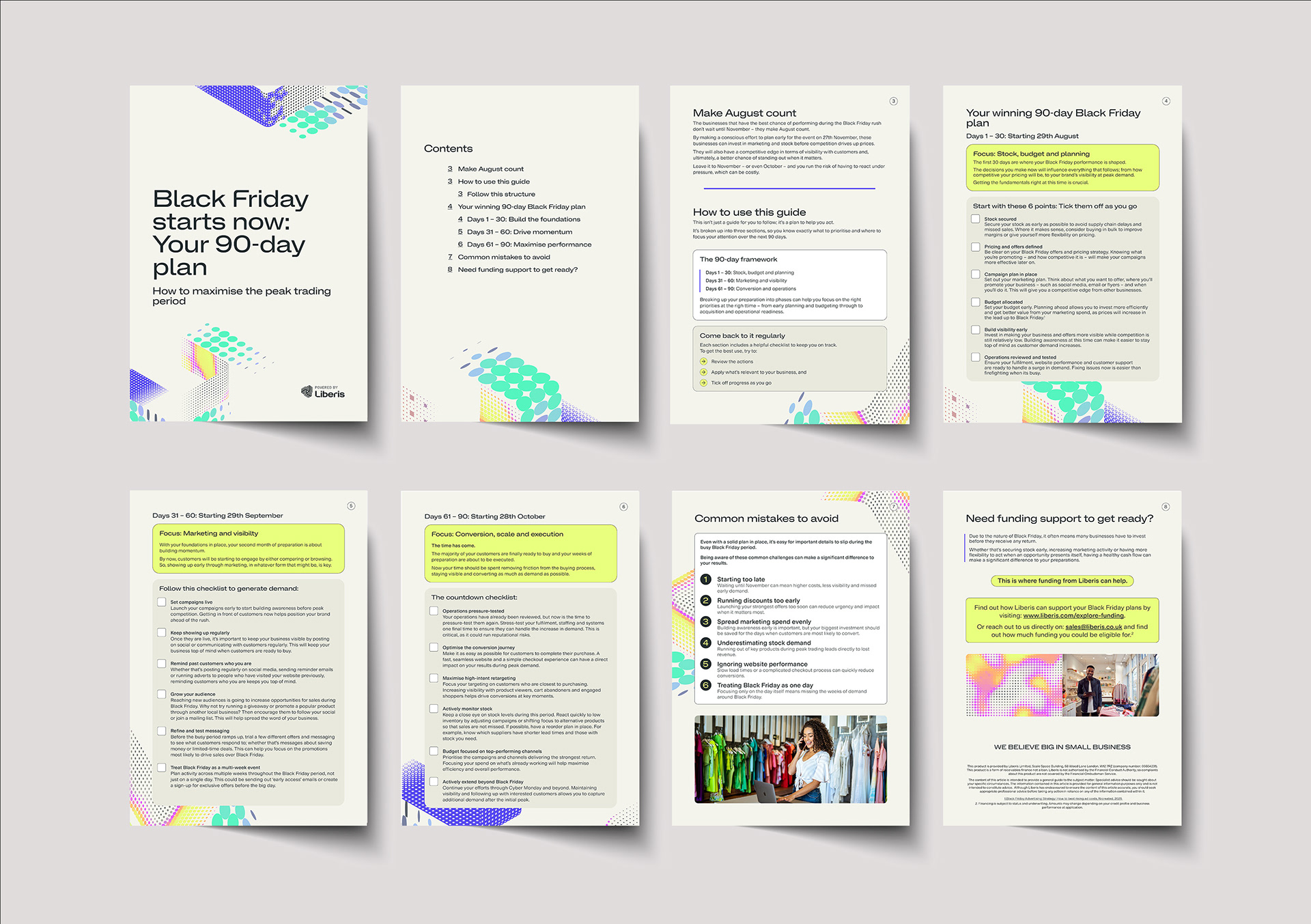
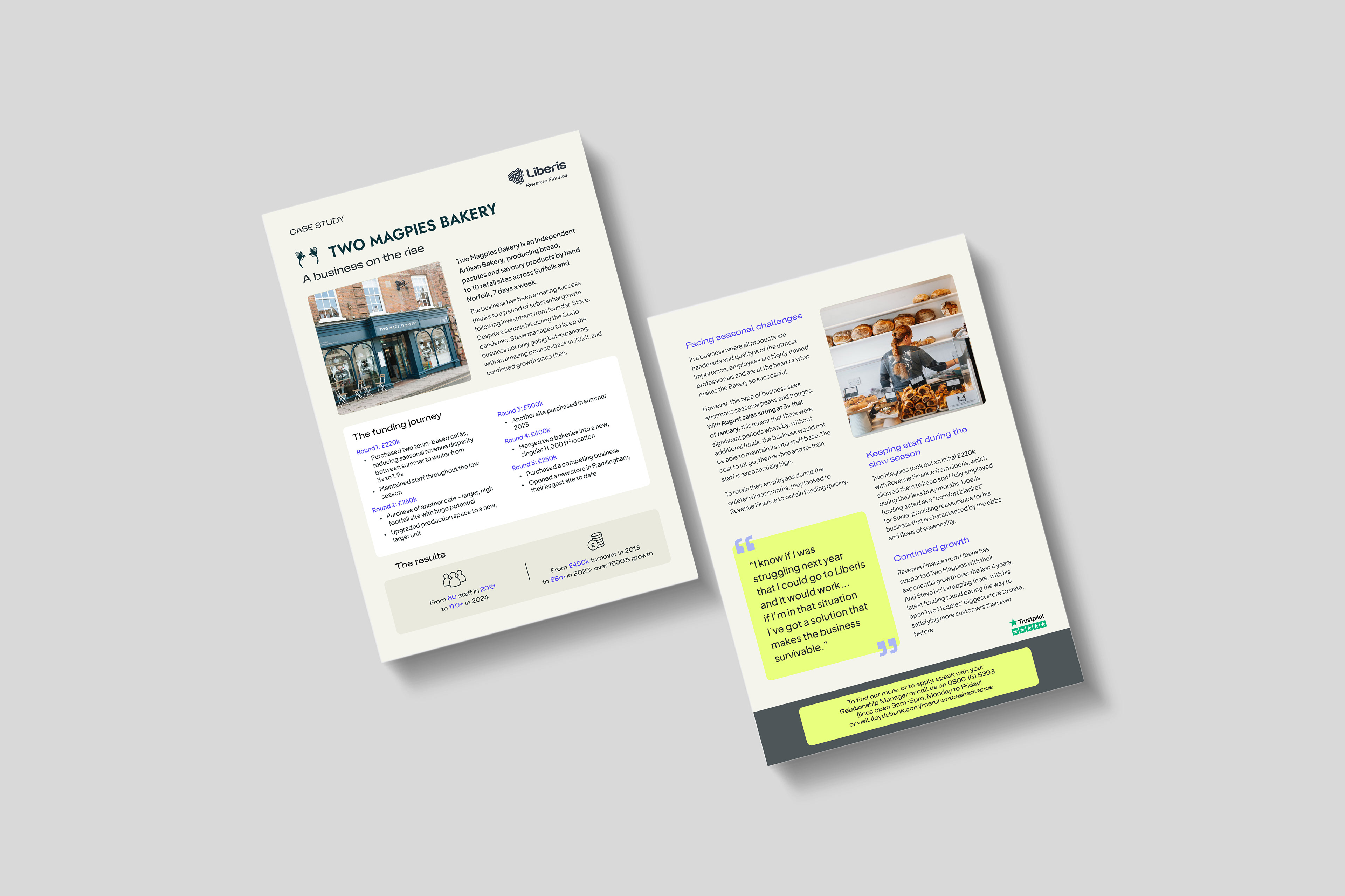
I created a B2B white paper called "Black Friday Starts Now: How to Maximise the Peak Trading Period", using Liberis's graphics and brand guidelines to make it colourful and engaging rather than dry, while structuring it so it could also work as a practical planning document for clients. I produced case studies of existing Liberis clients, turning their results into success stories that could be shared with other clients as proof. I also designed pitch decks showing how businesses could grow using Vagaro Capital together with Liberis. Across all of these, the priority was strong typography, clear hierarchy and a logical structure, so complex information stayed easy to follow.
These projects demonstrate an ability to organise and present complex information in a clear and considered way, balancing visual design with readability and structure. Across each piece, the focus remains on clarity, brand consistency and effective communication, ensuring that content is both engaging and easy to navigate for its intended audience.